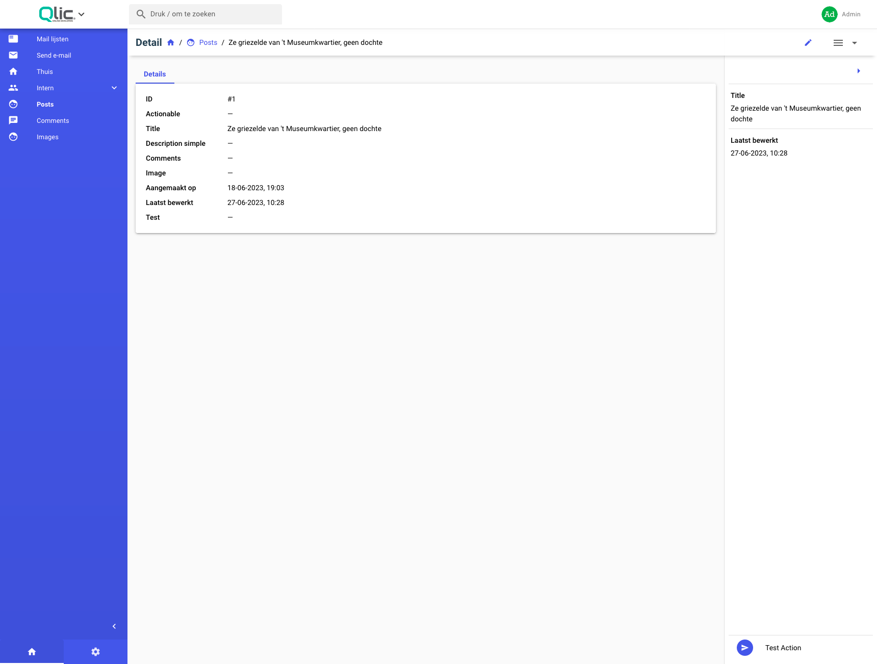
Resource Detail Sidebar
This feature adds a sidebar on the Resource Show page that a developer can customize.

Currently the sidebar can have options, fields and actions.
Usage
Currently to enable the sidebar on your Resource you need to implement the following function:
class ExampleResource extends QoreResource
{
    public function sidebarLayout(Model $model): SidebarLayout
    {
        return SidebarLayout::builder()
            ->addField('title');
    }
}
Builder methods will be chained
You have the following customization options:
Adding Fields
You can add a field to your sidebar by using it's name.
public function fields(): FieldCollection
{
    return new FieldCollection(
        Id::make(),
        Text::make('Title', 'title')->rules('required', 'max:100')
    );
}

public function sidebarLayout(Model $model): SidebarLayout
{
    return SidebarLayout::builder()->addField('title');
}
Adding Actions
You can add existing actions from the actions() of the resource by the following 2 methods:
public function actions(): ActionCollection
{
    return new ActionCollection(
        new TestAction()
    );
}

public function sidebarLayout(Model $model): SidebarLayout
{
    return SidebarLayout::builder()
        ->addAction(new TestAction())
        ->addAction(TestAction::class); // or by using the class-string
}
Note: The actions will be displayed in the order you add them, top to bottom
Adding Groups
As with the main menu, groups can be created, so fields can be grouped together.
SidebarLayout::builder()
    ->addCategory(
        fn(CategoryBuilder $builder) => $builder->setName('Test Category')
            ->setDescription('category description')
            ->addField('title')
    )
The callable expects to have returned an instance of CategoryBuilder, here we use an arrow function, but you need to ensure your function returns an instance of CategoryBuilder, either the one injected as a parameter, or a new one
Adding fields
You can add fields, in the same way you would add them to the sidebar, by calling addField
SidebarLayout::builder()
    ->addCategory(
        fn(CategoryBuilder $builder) => $builder->addField('title')->addField('updated_at')
    )
Customizing
The following options are available for a category:
// Name & Description
// The name will be used to key the Category, it should be unique
// The name is a required property while the description is not
SidebarLayout::builder()
    ->addCategory(
        fn(CategoryBuilder $builder) => $builder->setName('Title of Category')->setDescription('A caption text to be added under the titlte')
    );

// Behaviour Settings
//
// Make the group a toggable group (default behaviour)
SidebarLayout::builder()
    ->addCategory(
        fn(CategoryBuilder $builder) => $builder->setName('Test')
            ->setToggable(true) // can be set to false to disable the expansion of the group
    );
// If your group is a toggable group, you can set the default state to either opened or closed
SidebarLayout::builder()
    ->addCategory(
        fn(CategoryBuilder $builder) => $builder->setName('Test')
            ->openedByDefault()
            ->closedByDefault()
    );

// Separator
// As with the the sidebar, you can add a separator between fields that are nested in a group, the only difference is that the separator is disabled by default
SidebarLayout::builder()
    ->addCategory(
        fn(CategoryBuilder $builder) => $builder->setName('Test')
            ->setSeparator(true)
    )
Sidebar Options
Collapsable
You can enable/disable the collapsing option for the sidebar with the following functions:
SidebarLayout::builder()->collapsable(canCollapse: false)
Default State
You can change the sidebars minimization status on the page load by calling the openByDefault or closedByDefault
SidebarLayout::builder()->closeByDefault() // sidebar will be minimized on page load
SidebarLayout::builder()->openByDefault() // sidebar will NOT be minimized on page load
Separator
You can enable a separator between fields
SidebarLayout::builder()->separator(true) // enabled by default
SidebarLayout::builder()->separator(false) // disable a separator between fields
Custom Component
You can replace the default sidebar, by implementing a custom Vue component for the sidebar.
SidebarLayout::builder()->setComponent('custom-sidebar-component'); // the name you use here should be a component that is registered globally inside the `boot/app.js`
<template>
  <!-- More info in Quasar Docs -->
  <q-drawer
    v-model="sidebarEnabled"
    side="right"
    show-if-above
    bordered
  >
     <div> content here </div>
  </q-drawer>
</template>

<script>
export default {
  // by default the following props are provided
  // where actions are all the available actions for the current resource, should be filtered with the sidebar.actions keys
  // where fields are all the available fields for the current resource, should be filtered with the sidebar.fields keys
  // where values are all the available values for fields (the model) for the current resource
  // where sidebar will have all the data you need to render fields, actions and the custom options that the developer set
  // where resource is all the data for the current resource that you are showing
  // where canUpdate is a boolean parameter for the edit-field-inline component
  props: ['actions', 'fields', 'values', 'model', 'sidebar', 'resource', 'canUpdate'],

  // this events will be used by actions & editable fields inline
  // where action-success should be emitted when an action completed with a success title so that the Resource Page can do stuff accordingly
  // where field-reload should be emitted when an inline-field is edited (see docs for edit-field-inline)
  emits: ['action-success', 'field-reload'],
  data () {
    sidebarEnabled: true
  }
}
</script>
You will need to handle all the state & actions code by yourself if you do this!
Beware that the
resource-sidebarComponent name is used by the default sidebar!