User Usage
This document represents an introduction to the Layout Builder, it's concepts and how to use it to create custom layouts.
Functionality
- Creating Layouts in an Interactive UI
- Drag & Drop
- Customizable settings for pages
- Importing and exporting
- Different pages on different responsive options
Types of Layouts
There are 2 different types of layouts and 3 pages that you can edit them from.
Detail Layout
The Detail page can have a custom layout. To start editing the layout of this page you should visit a Resource, and then from inside the table you should view the detail page.
If everything is set up correctly, you should be able to see an icon that will redirect you to the layout builder of the detail page.
Create & Edit Layout
The Create & Edit pages will use the same layout. You can edit them from 2 places.
- You can edit it when trying to create a resource, a similar button as in the Detail Layout will show up in the navbar.
- You can edit it when editing a resource, a similar button to the one in the Detail Layout will show up in the navbar.
Concepts
The Layout builder has 2 important concepts:
Layouts (Screens)
From now on this guide will refer to layouts as in a screen.
Screens are the actual pages that will be shown. They are composed of 3 elements:
Blueprints
Blueprints represent a small part of the layout that has been broken up into parts and then will be composed together to create a screen.
Elements
Elements represent stuff that you may only need inside a screen, for example Tabs.
You can add Tabs which will then use other Blueprints to display their content.
Content Blocks
Content blocks represent relations on a resource. This will be displayed as a table. They are very similar to what you will have by default in different tabs of a resource.
Blueprints
Blueprints represent a part of the layout that will be composed later with other parts to create a full layout.
You can think of blueprints as cards on a normal page, each card will map to a blueprint.
For example:
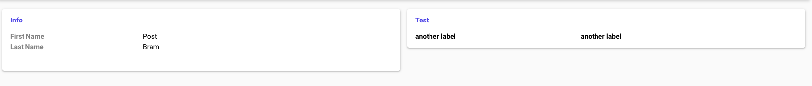
This two cards will be mapped to 2 different blueprints, one named Info and one named Test
The Builder Interface
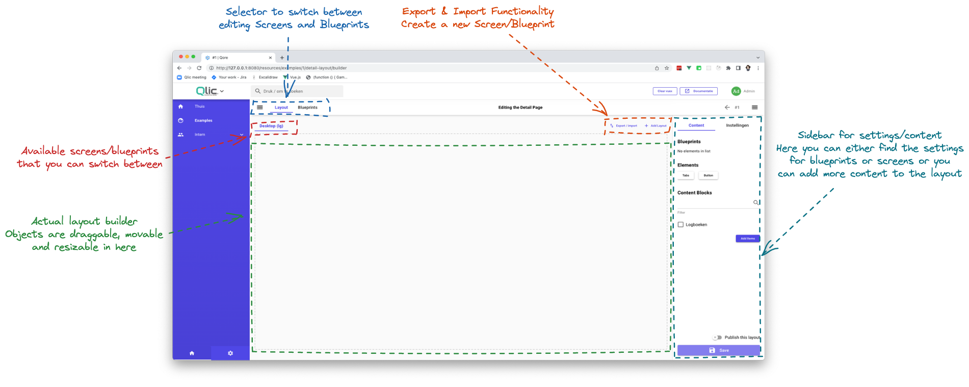
The layout can be broken into 4 parts:
- The main navbar
Here, you are able to switch between editing the Screens or Blueprints. You also have toggles for the Left Sidebar and the Right Sidebar so you can preview your layout better.
- Secondary navbar
Here, you will be able to switch between each Screen or Blueprint.
- Actual layout builder
Inside here, you will see a preview of how the layout will look. Items will be resizable and movable.
- The sidebar
Inside here, you can edit the settings for the Screen/Blueprint or you can add more content.
Creating a layout
We will start by creating a Layout. To do that, head into the layout builder and do the following steps:
Creating a Screen
When you enter the Layout Builder on a Resource that didn't have custom layouts before, a new Screen will be generated for you.
Screen Settings
A screen has the following settings:
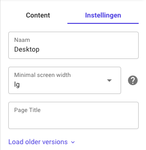
Name
The name of the Screen, this will be used inside the Layout Builder to identify different screens, to not be confused with the Page Title that's explained below.
Minimal Screen Width
The layout you are creating will only be applied on screens which are above or equal to the minimal width selected.
These are the following widths you can use:
xl- Desktop or Laptoplgormd- Tablets or Older Laptopssmorxs- Smartphones
For example to have a perfect responsible layout, you will create 3 screens according to the following options:
Desktop(lg)Tablet(md)Phone(xs)
Page Title
The actual title that will be used inside the navbar and inside the tab name inside the browser.
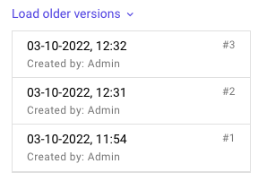
Load older version
Besides this, inside the settings Tab of the sidebar you will see a Load older version.
This will show older versions of the screen, on select they will replace the current screen but the changes are not saved, you need to save them!
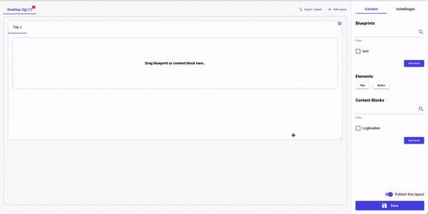
Adding Content to the Screen
Inside the sidebar we can see we have 3 categories.
Blueprints
Inside here you will see a list with all available blueprints.
You can select multiple blueprints at a time and add them all the same time.
Elements
Elements represent reusable layout components that you can use inside your screen. The following elements are currently available:
Tabs
A customizable Tabs Component, in which you can add or remove tabs which will map to a Blueprint/Content Block
Usage:
After you add a tabs component to your page you will be presented with a default Tab 1 with empty content. To
add content to the tab you should drag either a blueprint or a content block inside it.
Button
A button, go below to Button Element for further documentation.
Content Blocks
You will see a list of all relations on the resource, that you can add and will be displayed as a table.
Creating a blueprint
When you create a blueprint, you will be followed with a dialog with the following inputs:
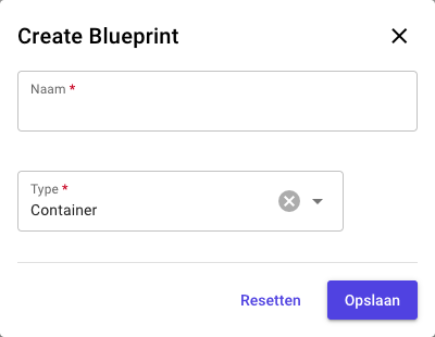
- Name The name of the Blueprint that will be used to identify it around the Layout Builder
- Type The type of the Blueprint (this is changeable later)
Blueprint Types
At the current time this are the following types you can use for a blueprint:
- Container A normal container, no styles added to the blueprint, it will look the way you make it
- Styled Container A container that has some styles added, it will have it's border rounded and have shadowed applied to it, making it similar to all the containers around the project
- Card A normal card, that will use the blueprint's name as the title of the card
It is recommended to use Container when you are making a blueprint that will be used inside another blueprint, as it
will not add any styles to it.
Blueprint Settings
A blueprint has the following settings:
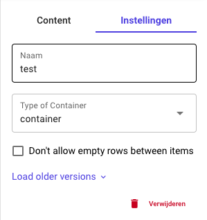
- Name The name of the Blueprint, in the case that the type of the blueprint is
Card, that Name will be used as the title of the card - Type of Container A select, that will let you switch the type of the blueprint
- Don't allow empty rows between items Restricts having empty rows inside the layout
The Load older versions works the same as the one in Screen settings
Adding Content to the Blueprint
Blueprints
Blueprints can be nested into other blueprints.
This is a feature that will mostly be used when you need to add Tabs to a page. Tabs only support one blueprint inside them, so you will have to create a blueprint that has all the other blueprints inside it (this is an intentional limitation).
Fields
Fields represent the actual fields from the Resource. When you add them they will default to a width and height, you should try to aim for similar width & height, especially for stuff like images.
When you are building a blueprint, fields will be displayed with a Placeholder, but when you switch back to
the Layout tab and add the blueprint to a Screen, you can preview the blueprint with actual field values
instead of the placeholder.
Content Blocks
Content Blocks can also be added inside blueprints, not only on Screens.
Elements
Elements represent raw components that you will use to build a beautiful blueprint.
Elements
Each raw element, or component have their own settings and functionality, and we will go through all of them below.
Each element inside the layout builder has a cog at the top-right, this button will open the settings for each component.

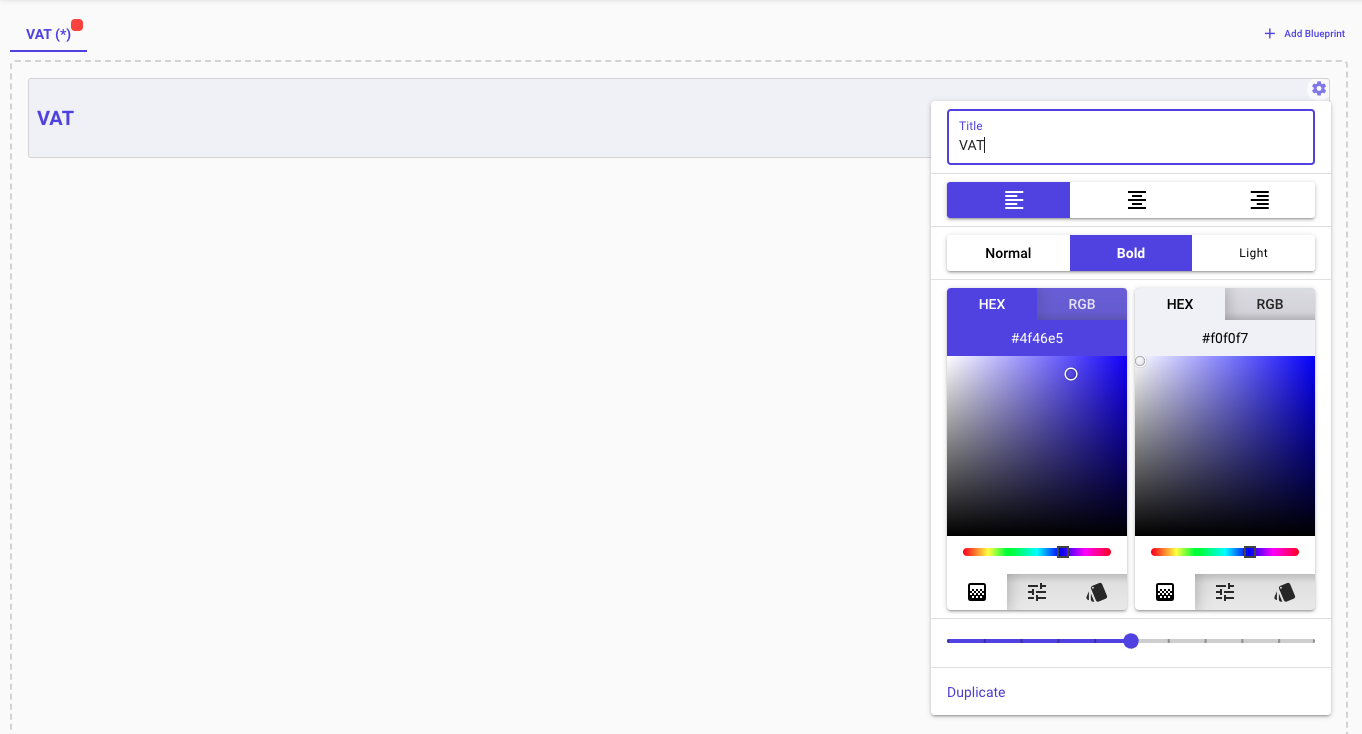
Title
The title looks as follows:

And it's settings are the following:
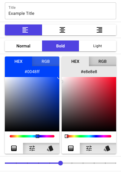
- Title The actual text that will be displayed inside the component
- Text Align 3 buttons that represent the text alignment: left, center and right
- Text Weight 3 buttons that represent the font weight: normal, bold, light
- 2 Color Selects The left color select represents the color of the text, while the right one represents the color of the background
- Text Size The slider represents the size of the text
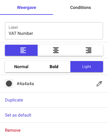
Label
The label looks as follows:

And it's settings are the following:
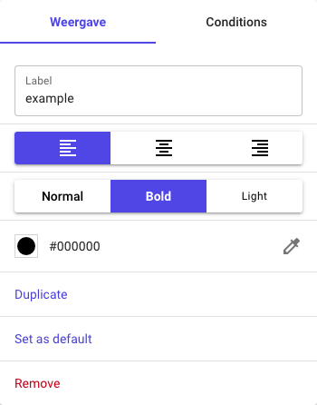
- Label The actual text that will be displayed inside the component
- Text Align 3 buttons that represent the text alignment: left, center and right
- Text Weight 3 buttons that represent the font weight: normal, bold, light
- The Color Select The color of the text
The conditions are explained in Conditions
Line
The line looks as follows, they can also be vertical:

And it's settings are as follows:
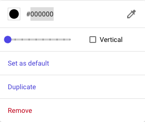
- The Color Select The line of the color
- Line Width The line width is represented by the slider
- Vertical Toggle Whether to make the line vertical or horizontal
Button
The button looks as follows, they can also be vertical:

And it's settings are as follows:
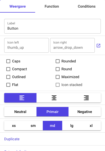
The Function
With a button you can have 2 functions:
-
Link You can make the button open a link, either in a new tab or the current one.
-
Attach a Resource When you choose the attach a resource function, you will presented with a select that will list all related resources to the current one. You can choose one resource and when the button is pressed, it will open a menu that will create the new resource you pointed it to and relate it to the current one, it is similar to how this is shown in normal pages.
Button functionality will only be available on the actual page, to test your buttons, you should publish the Layout and go back to the page itself to test it.
Element Common Settings
Besides this, all elements will have a Duplicate, which will act as a clone, it will make the same element with same
settings but the 2 elements will not be linked in any way (ie: changing one, won't change the other).
A Set as default, which is described in Element Default Settings.
And a Remove button.
Element Default Settings
As we can see, when opening the settings menu, we have an option Set as default.
While building the layout, we may find that we want our elements to look the same across the layout builder, but we don't want to edit each one every time we add a new one. For this, after we edit an element we can push the settings to be the default for new elements that will be added in the future.
This will only impact new elements added to the layout, not existing ones.
The other option, is to edit them from inside the module settings:
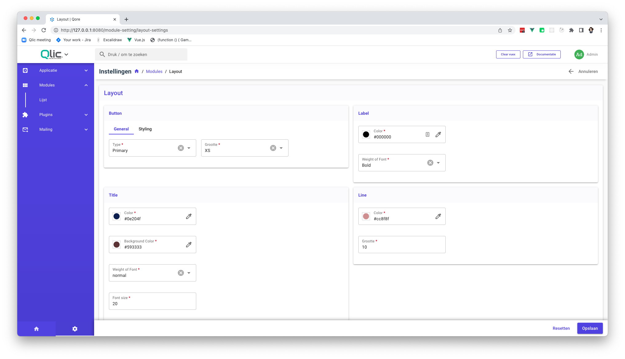
It is recommended to update the default layout from inside the Layout Builder, as there you can have a preview of how it will look like.
Settings that are able to set as default:
Button
text | ❌ |
icon-left | ❌ |
icon-right | ❌ |
text-align | ✅ |
button-type | ✅ |
button-size | ✅ |
caps | ✅ |
compact | ✅ |
outlined | ✅ |
flat | ✅ |
rounded | ✅ |
round | ✅ |
maximized | ✅ |
icon-stacked | ✅ |
Title
text | ❌ |
text-align | ✅ |
text-weight | ✅ |
text-color | ✅ |
background-color | ✅ |
text-size | ✅ |
Label
text | ❌ |
text-align | ✅ |
text-weight | ✅ |
text-color | ✅ |
Line
color | ✅ |
width | ✅ |
vertical | ❌ |
Conditions
Conditions are present on many elements, like label, field etc.
They let you add functionality to them based on conditions that are applied to the resource.
Condition Types
The following conditions are available, and we will go through all of them:
For all conditions, you will be able to select the field from the Resource you want the condition to run against
Field Value is Empty
If the field value you selected is empty.
Field Contains Text
Another text input will show, in which you can input the text you wish to compare to.
Field Value is Equal or Greater Than
If the field is a number you can enter a number to compare against.
If the field represents a text, the length of the text will be used for comparison.
Field Value is Equal or Lesser Than
If the field is a number you can enter a number to compare against.
If the field represents a text, the length of the text will be used for comparison.
Field Value is Greater Than
If the field is a number you can enter a number to compare against.
If the field represents a text, the length of the text will be used for comparison.
Field Value is Lesser Than
If the field is a number you can enter a number to compare against.
If the field represents a text, the length of the text will be used for comparison.
For complex fields (relations), another text field will be shown called nested.
Inside this field you can write a name of the field of the resource that's related to.
For example:
Resource 1 has a relation with Resource 2
You will be able to, in the nested text field, write a field name from Resource 2 to compare against
Condition Resolution
The following then options are available:
Show Text
The content that will be shown inside the show_text field will replace the content of the label, field etc.
For example, you can create a condition that will trigger when the field_value_is_empty and display the text -.
Hide Self
The content of the label, field, etc. will be hidden when the condition is met.
Apply Styling on Self
With this option, you can override the styling of the content with CSS.
Apply Animation on Self
You will be able to choose an animation, when the condition is met, that animation will be played for one time on
the label, field, etc.
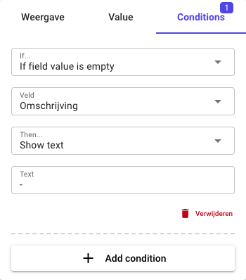
Creating a condition
We have 2 Resources, the Resource we are editing and a related Resource that has a field called paid with the value of
false.
We will create a label that will show the text - if the paid value is false. To do that you should follow this steps:
On elements that allow you to set conditions, beside the settings tab (when you open the cog), you will see
a Conditions tab.
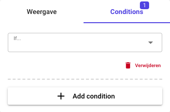
In the If, you can select one of the types described in Condition Types
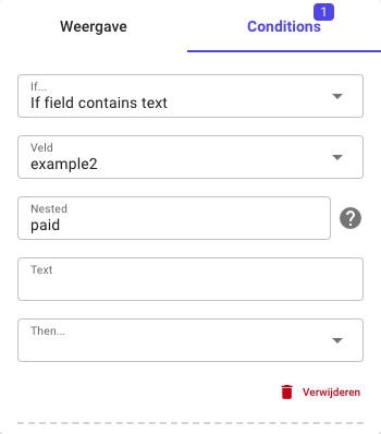
We will select the field_contains_text to show-off how the nested values work for relations.
The following fields will be shown now: Field, Text and Then
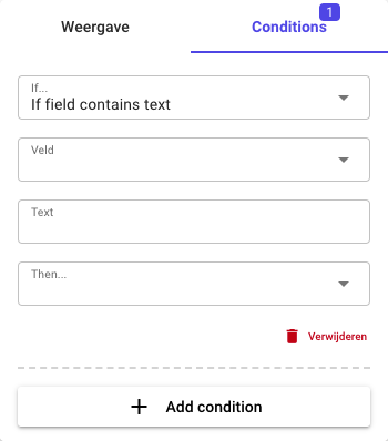
In the Field dropdown we will select the option example2 which is another Resource, related to the current resource
we are working on, that defines a BelongsTo relation.
We can see that a new field called Nested showed up. In this field we will write
The Example2 resource, has a true/false field called paid.
We will write paid inside the Nested text-input
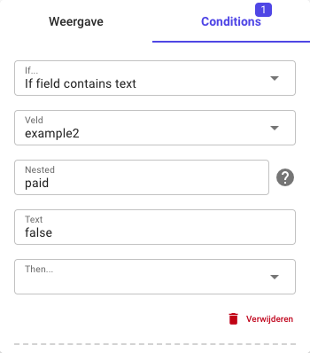
In the Text input, we will use the either true or false, for now we will want the label to show - when the value
for paid is false, so we will use false.
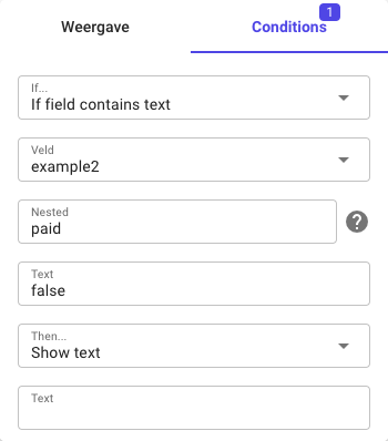
The final step is to choose the then step, see Condition Resolution for more info.
We want to show the text - when the status is not paid so we will write - inside the new Text field that appear,
leaving us with the final condition looking like this:
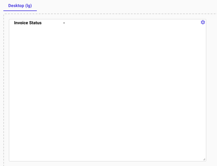
We can go back to Layout tab, to see a Preview of the Screen, with the Condition working:
We can see how the label shows -:
Demo Layout Creation
We have the following 2 Resources with the following fields
| Example 1 | Example 2 |
|---|---|
First Name (Text) | Description (Textarea) |
Last Name (Text) | Paid (Checkbox) |
VAT Number (Vat Number) | |
Description (Textarea) | |
Example 2 (BelongsTo) |
The resource Example 1 has the following layout:
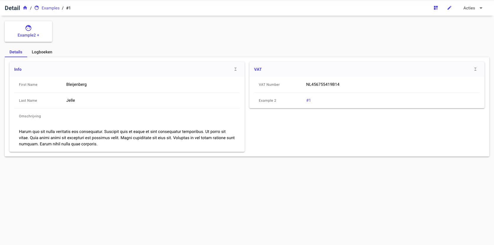
Step 1 - Breaking down the layout
We can break down the screen in the following parts:
- An attach button to the
Example 2resource - A tabs element with 2 tabs (Details and Logs)
Details Tab
The Details Tab is composed of 2 Cards, those 2 will be converted to 2 Blueprints:
Info Blueprint
With the following fields, split by a line between them:
- First Name
- Last Name
- Description
VAT Blueprint With the following fields, split by a line between them:
- VAT Number
- Example 2
All the fields will have a condition, that will display the value - when that field is empty.
In the end, both of the blueprints will be added to a Blueprint, called Details
Logs Tab The Logs Tab is just the Content Block to logs
We can now go into the Layout Builder and start recreating the layout 😄
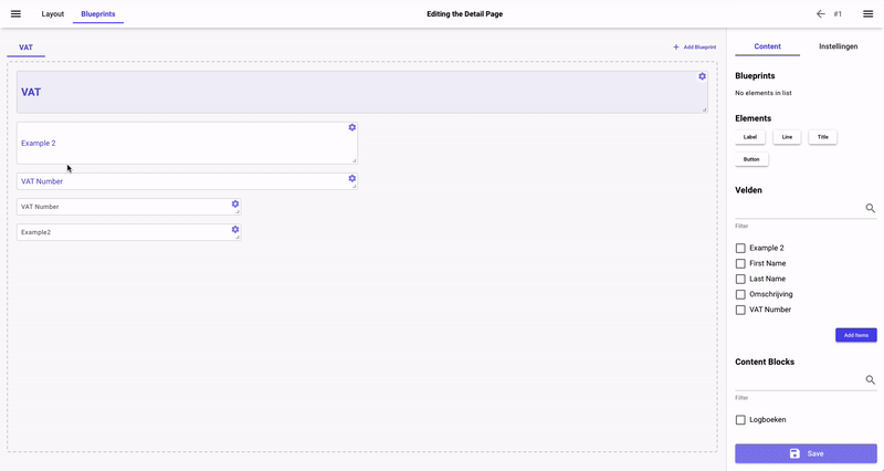
Step 2 - Creating the Blueprints
After we entered the Layout Builder, we can switch to the Blueprints Tab, where we will create the blueprints.
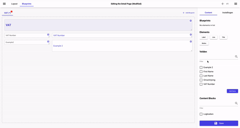
2.1 Create the VAT Blueprint
We know that this blueprint will be used inside another one, so it's type should be a Container.

Because we are using a Container, we need to add the Title ourself, to do that we need to add the Title element from the right sidebar.
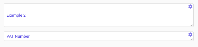
Now, we need to add the 2 fields VAT Number and Example 2, we can go ahead and select them both from the sidebar and press Add Items.
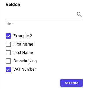
They should now appear in the Layout Builder with a placeholder with their name:
We want to add the condition that we described above, show a - when the field is empty, we can do that from inside the field settings.
We will do it for the Example 2 field:
Repeat the same step for the VAT Number field as well.
We now want to add the labels, to do that we can go on the sidebar and press on the Label element:
We will first do the VAT Number label, we set the text to that and continue by setting its color and weight.
The Label in our picture is gray and light, after we modify these settings we can either use the Duplicate option or the Set as default to have
these settings for every label inside the Layout Builder, we will use the lather option.
With the settings set we can now add a new Label with the content Description.
Our final setup should look something like this:
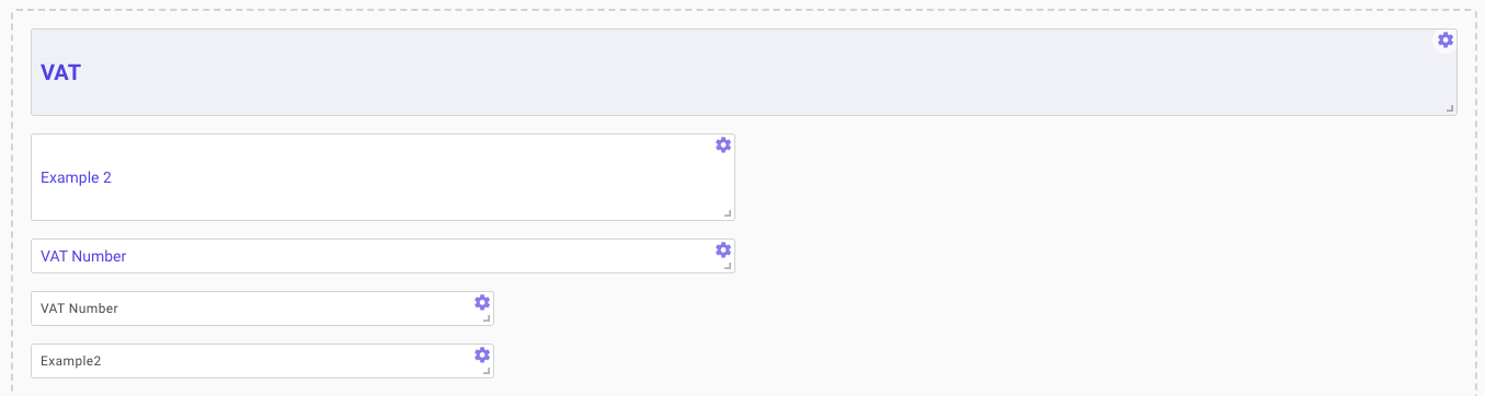
We can now re-arrange our elements inside to have the labels before the fields:
The last step is to add a line between the fields and Save.
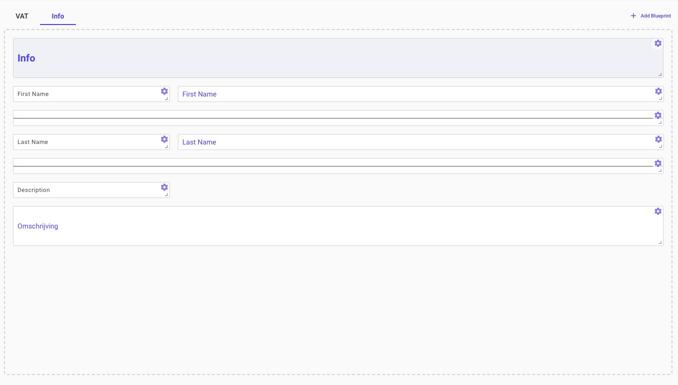
2.2 Create the Info Blueprint
We will repeat the same process for creating the Info blueprint as the one for VAT.

We now add the Title, Fields, Labels and Lines.
! Do not forget to add the conditions as well.
The final layout should look like this:
2.3 Create the Details Blueprint
In this step we will combine the 2 blueprints created above into 1.
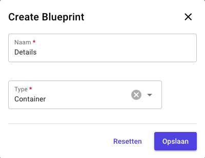
After we created the blueprint, we can go ahead and add the other 2 blueprints inside it.
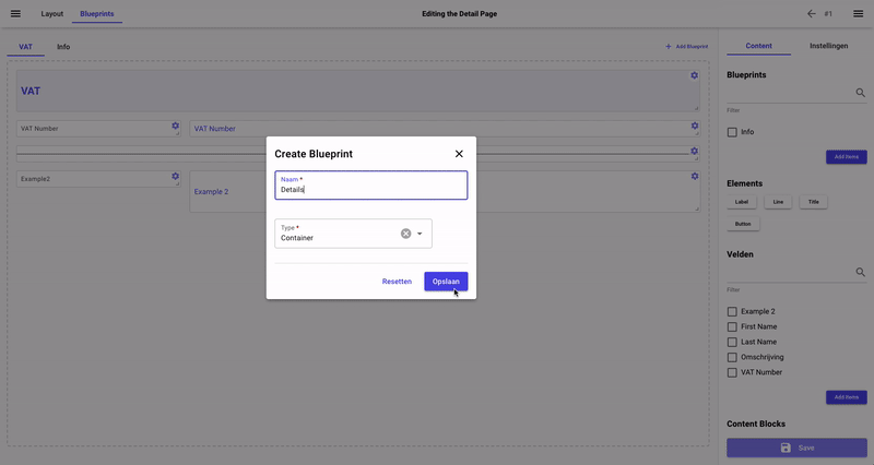
It is recommended, when combining multiple blueprints to have the blueprint with all of them at maximum height and then edit the height of the new blueprint inside the screen.
Otherwise you will have to fiddle around to find the height you are aiming for.
Step 3 - Creating the Screen
We have now finished all our blueprints, we need to combine all of them into one Screen and publish it.
3.1 Creating the Attach Button
We start by adding the Attachment Button.
To do that, we are going to add a Button with the function of Attach Resource.
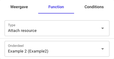
The issue now, is that we want our button to look like this:

But it's currently looking like this:
We are going to edit the button style to make it look like that with the following settings:
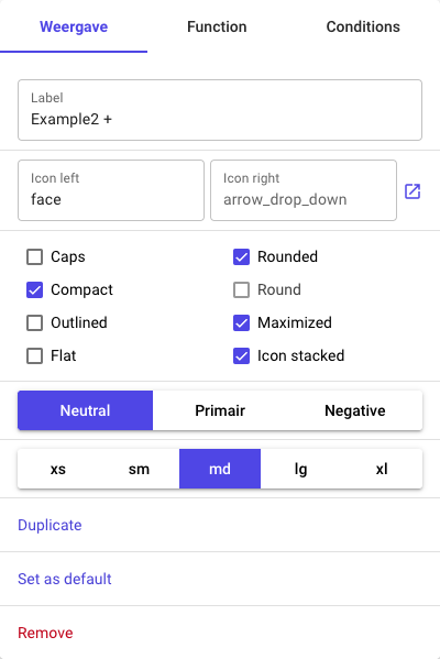
We can go ahead and test our button by publishing the layout and clicking on it:
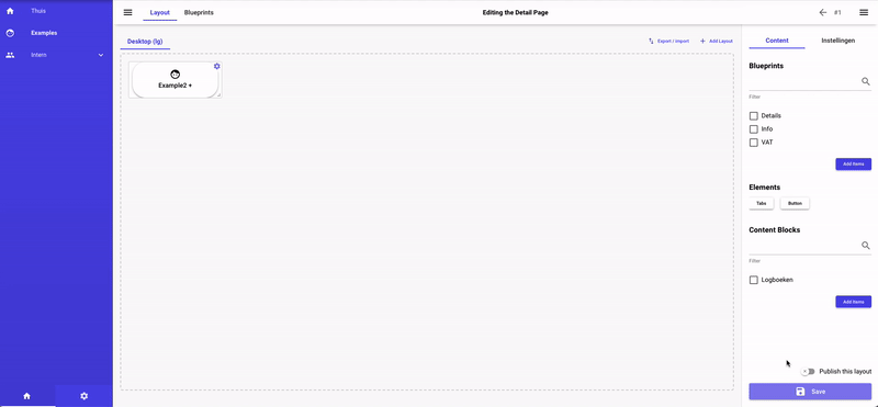
3.2 Creating the Tabs
We are not going to add a Tabs component with the following Tabs:
- Details
- Logs
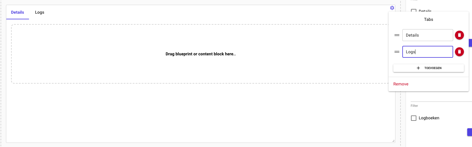
We continue by dragging our Details blueprint into the first Tab and the Logs Content Block
into the 2nd tab.
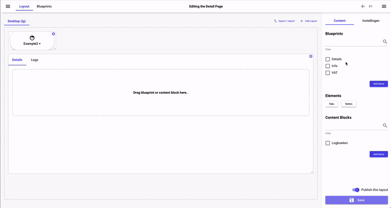
3.3 Publishing the Layout
Now that we are finished, make sure that the Publish this layout is checked and press Save.
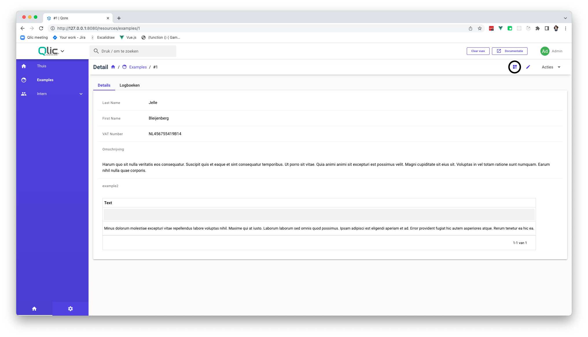
You can go and check out the Layout you made, by using the back button at the top, this is what it should look like:
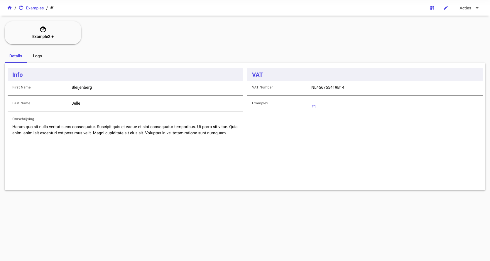
If you got this far, and got the results, Congrats on finishing your first layout! 💫 🎉